In today’s unpredictable business landscape, risk is no longer a background concern—it’s a daily reality. Cyber threats, regulatory shifts, supply chain disruptions, and reputational hazards can overwhelm even the most seasoned leaders. The challenge is no longer identifying risks, but making sense of them in real time. This is why risk dashboards are quickly becoming the must-have governance tool across industries.
From Data Overload to Clear Insight
Every organization collects massive amounts of risk-related data—incident reports, compliance checks, audit findings, financial exposures. Without a structured way to interpret this information, decision-makers face chaos instead of clarity.
That’s where dashboards come in. By visualizing risk data in charts, heat maps, and trend lines, leaders can spot vulnerabilities instantly, prioritize threats, and make informed decisions before problems escalate.
👉 According to Gartner, companies that integrate risk dashboards into their governance processes improve decision-making efficiency by up to 40%.
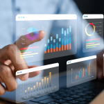
The Power of Visualization
A risk dashboard is more than a reporting tool—it’s a lens on the future. By turning raw numbers into clear, actionable insights, dashboards help:
- Highlight critical risks before they spiral into crises
- Track trends to anticipate emerging threats
- Enable collaboration across departments with a shared view of priorities
- Demonstrate accountability to boards, regulators, and stakeholders
👉 The Financial Times notes that organizations with robust risk visualization tools are more agile in adapting to sudden market shocks and regulatory changes.
Why Dashboards Are a Governance Essential
Risk dashboards represent a cultural shift in governance. Instead of compliance being a backward-looking exercise, organizations can now take a proactive, forward-focused approach. This shift not only protects organizations but also strengthens stakeholder confidence.
The Challenge: Building the Right Dashboard
Of course, not all dashboards are created equal. The best ones are:
- Dynamic – updating in real time
- Customizable – reflecting the unique risks of each organization
- Intuitive – easy for leaders to interpret at a glance
A poorly designed dashboard risks overwhelming users with clutter or hiding critical details. The key is balance: clarity without oversimplification.
MPG: Turning Governance Data Into Action
At My Premium Governance (MPG), we believe that clarity is power. Our dynamic risk dashboards transform raw governance data into actionable insights, giving leaders the tools to make confident, timely decisions.
With MPG, chaos becomes clarity—and risk becomes opportunity.